Key Takeaways:-
- Build seasonal editions as variants of a locked master rather than new labels.
- Foil tone carries seasonal meaning before imagery or copy registers with a shopper.
- Gifting buyers respond to seal, band, and ornament cues that suggest presentation.
- Commit to two strong seasonal moments instead of diluting effort across four.
- Plan backwards from the shelf date, treating proofing as a fixed stage.
- FAQs
Seasonal packaging is one of the few moments when a brand gets permission to look different without confusing anyone. Shoppers expect it, retailers plan shelf space around it, and a limited run creates urgency that a standard SKU never generates. Foil suits these moments particularly well because it signals occasion instantly.
The challenge is that seasonal windows are unforgiving. Custom foil label design in the USA for a holiday release has to move from concept to delivered stock inside a fixed calendar, which means every creative decision carries a production consequence. The ideas that work are the ones built with that constraint in mind from the first sketch.
Design the Variant, Not a Whole New Label
The most efficient seasonal approach treats the standard label as a chassis. Core structural elements stay locked, proportions, logo position, mandatory information placement, while a defined zone carries the seasonal change. That might be a background colour, an ornamental band, or a single foil element swapped for the season.
This approach protects recognition and cuts turnaround dramatically. Shoppers still identify the brand at a glance, which matters when a seasonal version sits beside the regular product. Production also moves faster because the die line, substrate, and most of the artwork are already proven on press.
Elements worth designating as seasonal variables from the outset:
- A background field that can shift colour or texture per season.
- One foil accent zone, a band, ornament, or framing device.
- A short descriptor line for edition naming or seasonal flavour.
- An optional secondary foil colour reserved for premium releases.
- A small batch, year, or edition marker for collectability.
Matching Foil Tone to the Season
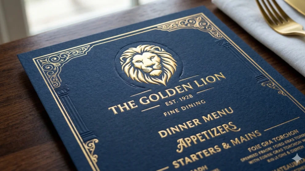
Foil colour carries seasonal association before any imagery registers. Warm gold reads as celebration and year-end gifting. Copper and bronze suit autumn, harvest, and craft positioning. Cool silver and chrome work for winter, clean seasonal resets, and new-year launches. Choosing against that expectation can work but should be deliberate.
Brands producing premium foil labels in the USA for gifting periods often pair a richer foil with a deeper background than their standard line uses. The contrast makes the limited edition feel genuinely distinct on shelf. It also photographs better, which matters when the same product carries a social and retail campaign simultaneously.
Gifting Cues That Change Buying Behaviour
Gift purchasing follows a different logic than self-purchase. A buyer scanning for a present looks for signals that the product will feel generous when handed over, perceived value, presentation quality, and a sense of occasion. Foil accents deliver those signals faster than copy does.
Small structural touches amplify the effect considerably. Seal-style foil elements, ribbon-like bands, and ornamental corners all suggest wrapping without adding packaging cost. For brands producing premium foil labels ahead of gifting season, these details often determine whether a product gets picked up as a gift or passed over for something that looks the part.
Seasonal Ideas Worth Planning Around
Not every season justifies a dedicated run, and spreading effort across all of them usually dilutes the result. Most brands get better returns from committing to two strong moments than from producing four rushed ones. The right choices depend on category and where buying spikes genuinely.
Approaches that consistently work in custom foil label design in the USA include year-end gifting editions with heavier foil coverage, spring refresh variants using lighter palettes with minimal metallic accent, autumn harvest editions in copper tones, and anniversary or milestone releases that reuse seasonal tooling. Each one gives sales a reason to exist without altering the core range.
Seasonal concepts that translate well to foil:
- Year-end gifting editions with a seal or crest element in warm metallic.
- Spring variants where foil is reduced to a single fine rule or monogram.
- Harvest and autumn runs using copper or bronze on uncoated stock.
- Winter editions pairing cool foil with deep matte backgrounds.
- Anniversary or milestone labels carrying a foil year marker.
Planning Backwards From the Shelf Date
Seasonal work fails on timing far more often than on creative. The retail date is fixed, distribution needs stock before that, and production needs approved artwork before that again. Working forwards from when the idea arrives almost always produces a compressed schedule with no room for a proof round.
Build the calendar in reverse instead. Premium foil labels in the USA for a seasonal release should have artwork locked well ahead of the on-shelf date, with proofing and material confirmation treated as fixed stages rather than compressible ones. The brands that repeat seasonal programmes successfully are usually the ones that start the conversation a season early.
Reusing Seasonal Work Year After Year
A well-structured seasonal label is an asset rather than a one-off expense. When the variant zone is clearly defined and the foil element reusable, next year’s edition becomes a colour and copy change rather than a fresh project. That compounding efficiency is what makes seasonal programmes sustainable for smaller teams.
Hart Label approaches seasonal work this way, building variant-ready templates so a holiday run can be refreshed rather than redesigned the kind of planning any brand running repeat seasonal editions should expect from a label partner. The first season costs the most; every one after it should cost noticeably less.
Treating seasonal releases as a system also improves the creative. When structure is settled, attention goes to the details that actually differentiate: foil tone, background depth, edition naming. Custom foil label design benefits enormously from that focus, because seasonal impact comes from a few confident choices rather than from reinventing the label each year.
FAQs
How far ahead should a seasonal foil run be planned?
Earlier than most teams expect. Artwork, proofing, and material confirmation all need fixed time, and seasonal demand means those stages cannot be compressed without risking the on-shelf date.
Does a seasonal label need to look very different from the standard one?
No, and usually it should not. Keeping structure consistent preserves recognition, while a defined variable zone carries the seasonal change clearly enough to signal a limited edition.
Is heavier foil coverage better for gifting editions?
Sometimes, but restraint still applies. A slightly richer foil element against a deeper background reads as premium, while broad coverage often flattens under store lighting.
Planning a holiday or limited-edition release for the coming season? Call Hart Label at 512-388-1144 or email your concept and target shelf date to map out a variant-ready foil template.
Add a Comment