
Key Takeaways:-
- Foil labels enhance packaging by adding visual appeal and a premium finish.
- Strong branding starts with consistent design and thoughtful label details.
- Strategic foil placement creates impact without overwhelming the packaging.
- Readability and functionality are as important as aesthetics in label design.
- Professional printing and testing help ensure high-quality, reliable results.
- FAQs
Packaging is often the first thing customers notice, making label design an important part of building a strong brand image. A well-designed foil label can add elegance, attract attention, and help products stand out in competitive markets. From color selection to foil placement, every detail matters. Understanding the right design techniques can help businesses create labels that look professional and leave a lasting impression.
Why Foil Labels Continue to Grow in Popularity
Packaging plays a significant role in how customers perceive a product. Before someone reads the ingredients, features, or benefits, they usually notice the packaging first. This initial impression often influences whether they decide to pick up a product, learn more about it, or move on to another option. Because of this, businesses are paying closer attention to label design and the impact it has on brand recognition.
Foil labels have become a popular choice because they add a premium appearance without requiring major changes to the product itself. The reflective finish creates visual interest and helps key design elements stand out. Whether used on cosmetics, beverages, candles, specialty foods, or wellness products, foil labels can help brands create a stronger presence in competitive markets. A thoughtful approach to custom foil label design in USA can help businesses achieve a more professional and memorable appearance.
Purpose of a Foil Label
Before beginning any design project, it is important to understand the purpose of the label. A foil label should do more than look attractive. It should communicate the brand message, support product positioning, and make information easy to read. When design decisions focus only on appearance, the final result may look impressive but fail to serve the customer effectively.
A successful foil label combines visual appeal with functionality. Customers should immediately recognize the product name, understand the brand identity, and locate important information without difficulty. Every design choice should support these goals while enhancing the overall presentation. This balance is one of the foundations of effective custom foil design in USA strategies.
Start With a Clear Brand Identity
One of the most important design tips is to establish a clear brand identity before selecting colors, fonts, or foil finishes. The label should reflect the personality of the brand and create consistency across all products. A luxury skincare company may prefer elegant metallic accents, while a modern beverage brand might choose cleaner and more contemporary styling.
Brand identity influences every aspect of the label design process. The tone of the messaging, typography choices, and visual hierarchy should work together to communicate a consistent image. When customers recognize a cohesive design style, they are more likely to remember the brand and develop trust over time. This is especially important when creating a premium foil label design in USA that aims to strengthen long-term brand recognition.
Choose Foil Colors That Match Your Product
Selecting the right foil color is an important part of creating an effective label. Different metallic finishes create different emotional responses. Gold is often associated with luxury and tradition, while silver can communicate sophistication and modernity. Copper and rose gold frequently create warmth and elegance, making them popular choices for beauty and lifestyle products.
The best foil color depends on the product category and target audience. A gourmet food brand may benefit from classic gold details, while a technology-focused product may look stronger with silver accents. Instead of choosing a finish solely because it looks attractive, consider how it supports the overall message of the packaging. Thoughtful color selection helps ensure the label feels intentional and aligned with the brand.
Keep the Design Clean and Focused
One of the most common mistakes in foil label design is using too many decorative elements. While foil can create a striking effect, excessive use may make the label appear cluttered and difficult to read. Customers should be able to identify the most important information quickly without becoming distracted by unnecessary visual details.
A clean design often creates a stronger impression than a crowded one. Strategic placement of foil can highlight logos, product names, or specific design features without overwhelming the overall layout. White space also plays a valuable role because it helps direct attention to key areas of the label. A simple design with carefully placed metallic accents often delivers the best results.
Prioritize Readability
No matter how attractive a label looks, it must remain easy to read. Customers rely on labels for information, and poor readability can negatively affect the overall experience. Fonts should be clear, appropriately sized, and easy to distinguish from the background. Decorative typefaces may look appealing, but they should never interfere with legibility.
Contrast is another crucial factor. Metallic finishes can sometimes reduce visibility if they blend too closely with surrounding colors. Designers should test color combinations carefully to ensure that text remains readable in different lighting conditions. Maintaining strong readability helps create packaging that is both attractive and practical for customers.
Use Foil to Highlight Important Elements
Foil should be treated as a design tool rather than a decoration. The most effective labels use metallic accents to emphasize specific elements that deserve attention. These might include the brand logo, product name, limited-edition messaging, or a unique design feature that supports the product story.
By limiting foil to selected areas, designers can create stronger visual contrast and improve the overall hierarchy of information. Customers naturally notice reflective elements first, making them ideal for directing attention toward key details. This strategic approach can significantly improve the effectiveness of custom foil label design in USA projects while maintaining a polished appearance.
Consider the Packaging Material
The container or packaging surface influences how a foil label will appear once applied. Glass bottles, plastic containers, metal tins, and paperboard packaging all interact differently with label materials and finishes. A design that looks excellent on one type of packaging may require adjustments when used on another surface.
Testing labels on actual packaging samples is an important step before final production. This allows designers to evaluate color accuracy, foil visibility, and overall balance. Understanding how the label performs in real-world conditions helps reduce surprises and supports a higher-quality finished product.
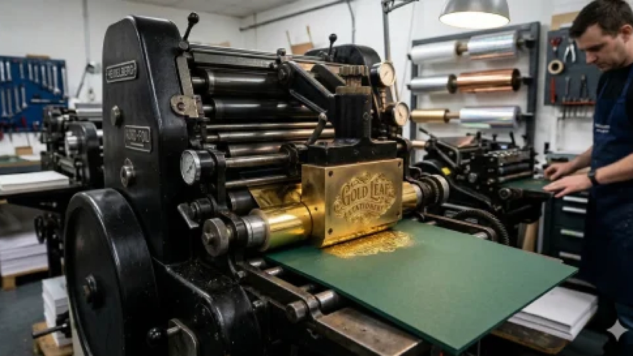
Work With Professional Printing Standards
Even the best design can lose its impact if the printing quality is poor. Foil labels require precision during production to ensure clean edges, accurate registration, and consistent metallic effects. Small design details must be prepared correctly to achieve the desired outcome during printing.
Professional preparation also helps maintain consistency across multiple production runs. Businesses depend on reliable branding, and customers expect products to look the same every time they make a purchase. Investing in quality production methods supports the success of custom foil design in USA projects and helps maintain a professional brand image.
Test Before Finalizing the Design
A label design should always be reviewed and tested before full production begins. Physical samples provide valuable insights that digital proofs cannot always reveal. Designers can evaluate readability, foil placement, color balance, and overall visual impact under realistic conditions.
Testing also allows businesses to gather feedback from team members, stakeholders, or potential customers. Small adjustments at this stage can significantly improve the final result. This extra step helps ensure that the packaging meets both design expectations and practical requirements before reaching the market.
FAQs
What is the biggest advantage of using foil labels?
Foil labels help products attract attention quickly while creating a more premium and professional appearance.
How much foil should be used in a label design?
Foil should be used selectively to highlight important elements such as logos, product names, or key design features.
Can foil labels work for both luxury and small businesses?
Yes, foil labels can benefit businesses of all sizes by improving product presentation and strengthening brand perception.
Why should label designs be tested before production?
Testing helps identify issues with readability, color balance, foil placement, and overall visual impact before final printing.
Creating the perfect foil label requires more than selecting a metallic finish. Transform ordinary packaging into a powerful brand statement with Hart Label Company’s custom foil labels, design expertise, and printing solutions. Contact us now via email or call 512-388-1144.
Add a Comment